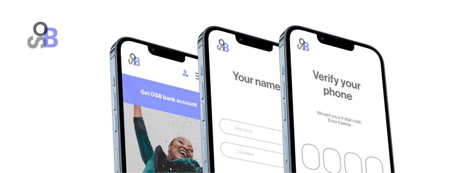
Project overview
UX RESEARCH
Research methods
User research
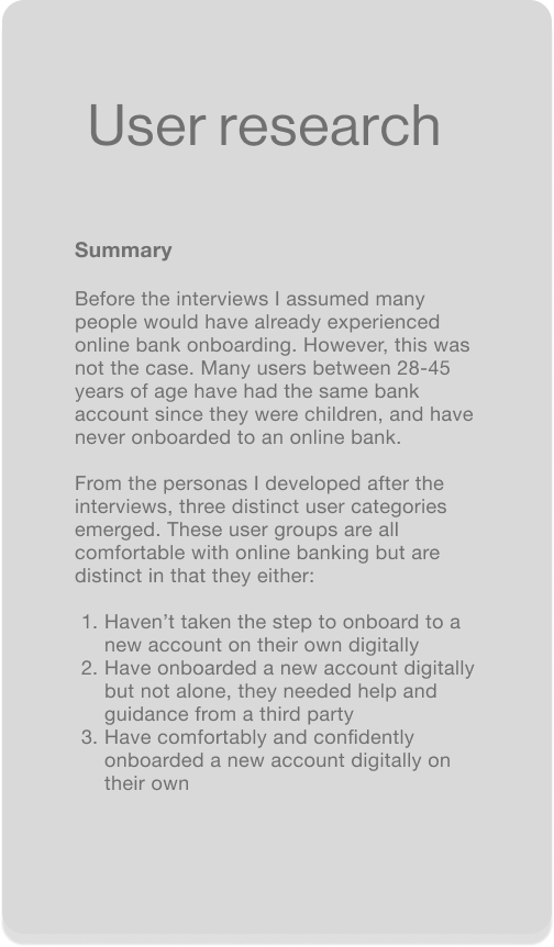
In the first stage of designing, I conducted user interviews, and created personas, to better understand the thoughts, feelings, and needs of people who use both traditional and online banks for their banking needs.
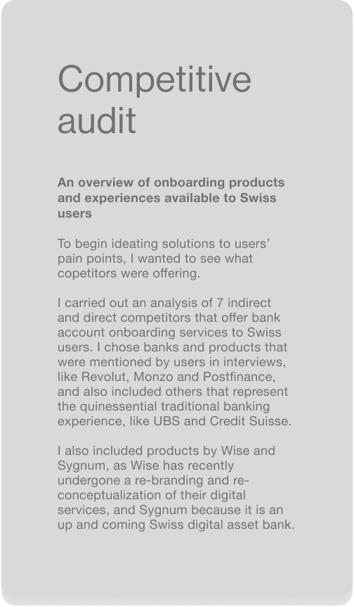
Competitive audit
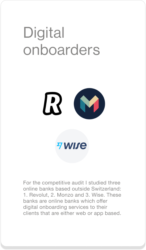
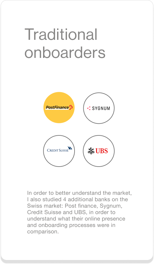
To begin ideating solutions to the main user pain points, I carried out an analysis of 7 direct and indirect competitors that offer digital and traditional onboarding for bank accounts in Switzerland.
Usability study
The overall research goal was to understand how easy it was for users to complete the onboarding process. Each activity targeted different steps in the process, in order to assess the user’s experience during each step.
What I learned about people who bank
Meet the traditional hybriders
Who are traditional hybriders? A group of people who use traditional banks and their in-person services, but who have also onboarded to digital products offered by their banks, like online banking. Fun fact about hybriders: some of them are often still using the bank accounts they started when they were children or teenagers. Their bank journeys suggest that the idea of what traditional banking is in Switzerland goes beyond just the in-person bank experience, and goes hand in hand with being clients of some of those banks that have been thriving in the Swiss banking market for generations.
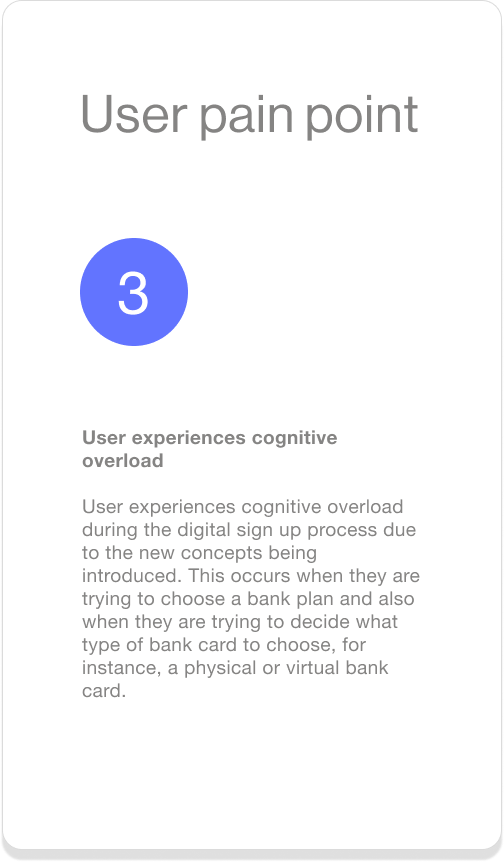
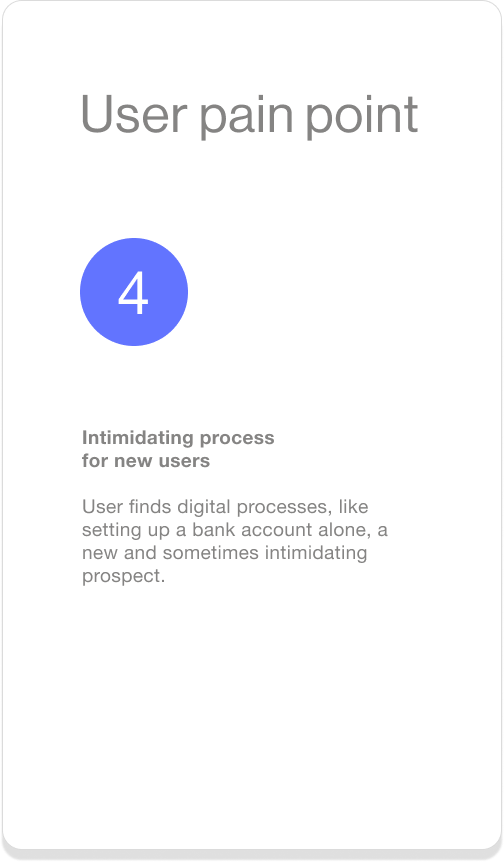
At the moment, traditional banks do not offer digital onboarding services for new bank accounts, and so digital onboarding for a new bank account is something completely new for many hybriders, and can be intimidating for those users who do not feel entirely comfortable using new online banks to store their assets, nor confident in their ability to use digital technologies on their own successfully.
Meet the onliners
Ok, so who are these onliners? They’re a group of people who have, despite all the amazing traditional banks available in Switzerland, onboarded to online banks as solutions to their financial needs. Why? To answer that question we can look at a fun fact: in 2020 38% of the Swiss population had a migration background, a statistic which suggests that Switzerland has become a melting pot for different cultures, and with that, people with evolving financial needs. Indeed, there are people living in Switzerland that need financial services that traditional Swiss banks either do not offer, or if they do, offer at a higher cost than their competitors. These are often people who are relocating to another country, perhaps for a limited period of time, or people who have relocated to Switzerland. Both have international financial needs that Swiss banks do not cater to.
Many people who have gone to online banks have had mostly positive experiences overall with digital onboarding. Of those people I spoke to, they would recommend these online banks to friends and family. Their positive experiences prove that many of the digital onboarding processes out there are successful, and relatively painless. There are, however, still pain points among users and gaps in the digital products being offered that can be addressed in order to improve the overall user experience during digital onboarding.
What onliners are saying about their digital onboarding experiences
-
“It was very annoying that I didn’t know how long it was going to take…what I was gonna be charged or how I could delete my account…I had never even heard of a virtual card. And then suddenly during the process they asked for a live picture of my face. And I looked horrible…and I couldn’t take it back! I guess I didn’t like that, the idea that I couldn’t control what picture of me was used.”
Digitally onboarded user
-
“They didn’t tell me how long it would take for the card to arrive. I didn’t know how long it took. And I think I wanted to find out and it was mostly automated support. There wasn’t like a phone number I could call. Only chat functionality. In the end I just waited for it and it arrived. I would have liked to been more informed of when I would get my card.
Digitally onboarded user
-
“The first time I heard about it, my sister wanted to find a way to send me money…and then she told me there is this bank online bank that they have been using..and why don’t you sign up? And I was like ‘yeah today, ‘yeah tomorrow’, and actually they did the sign up for me…they made an account for me and everything…And now it’s like the easiest!”
Digitally onboarded user
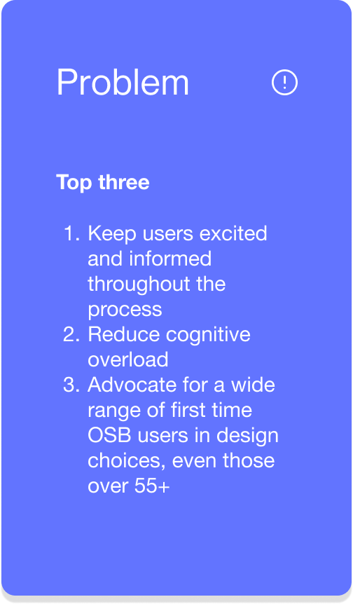
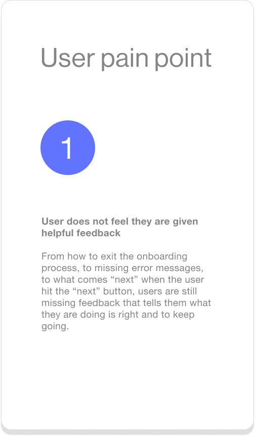
Summary of user pain points from user research

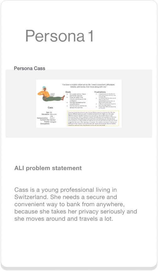
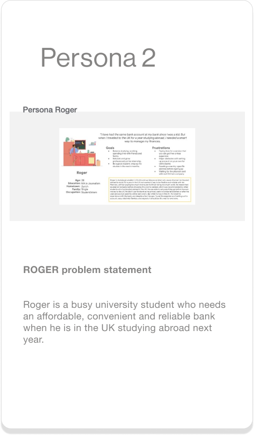
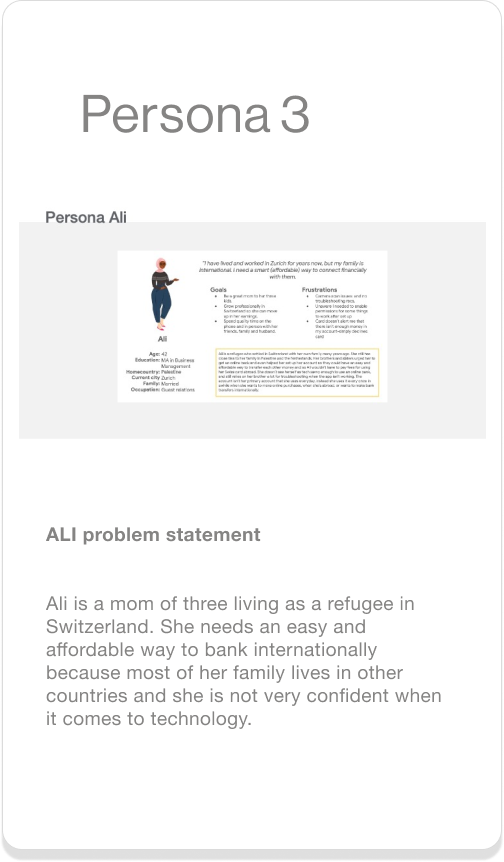
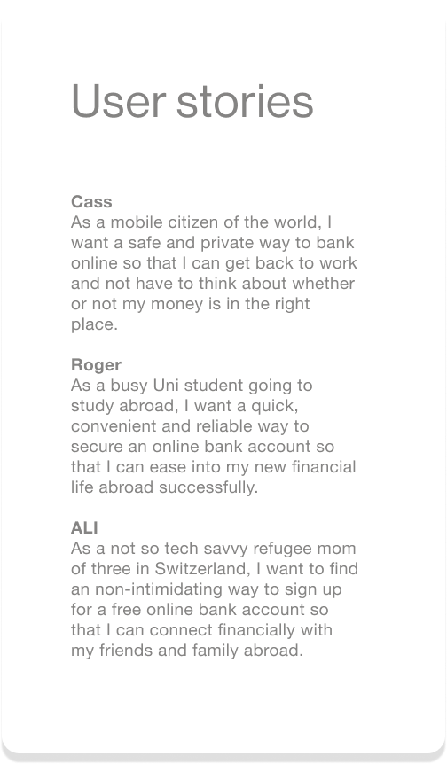
Synthesizing user research with personas and user stories
UX DESIGN
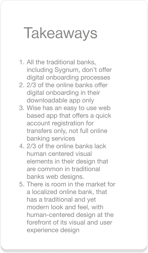
Understanding what’s available to people on the market
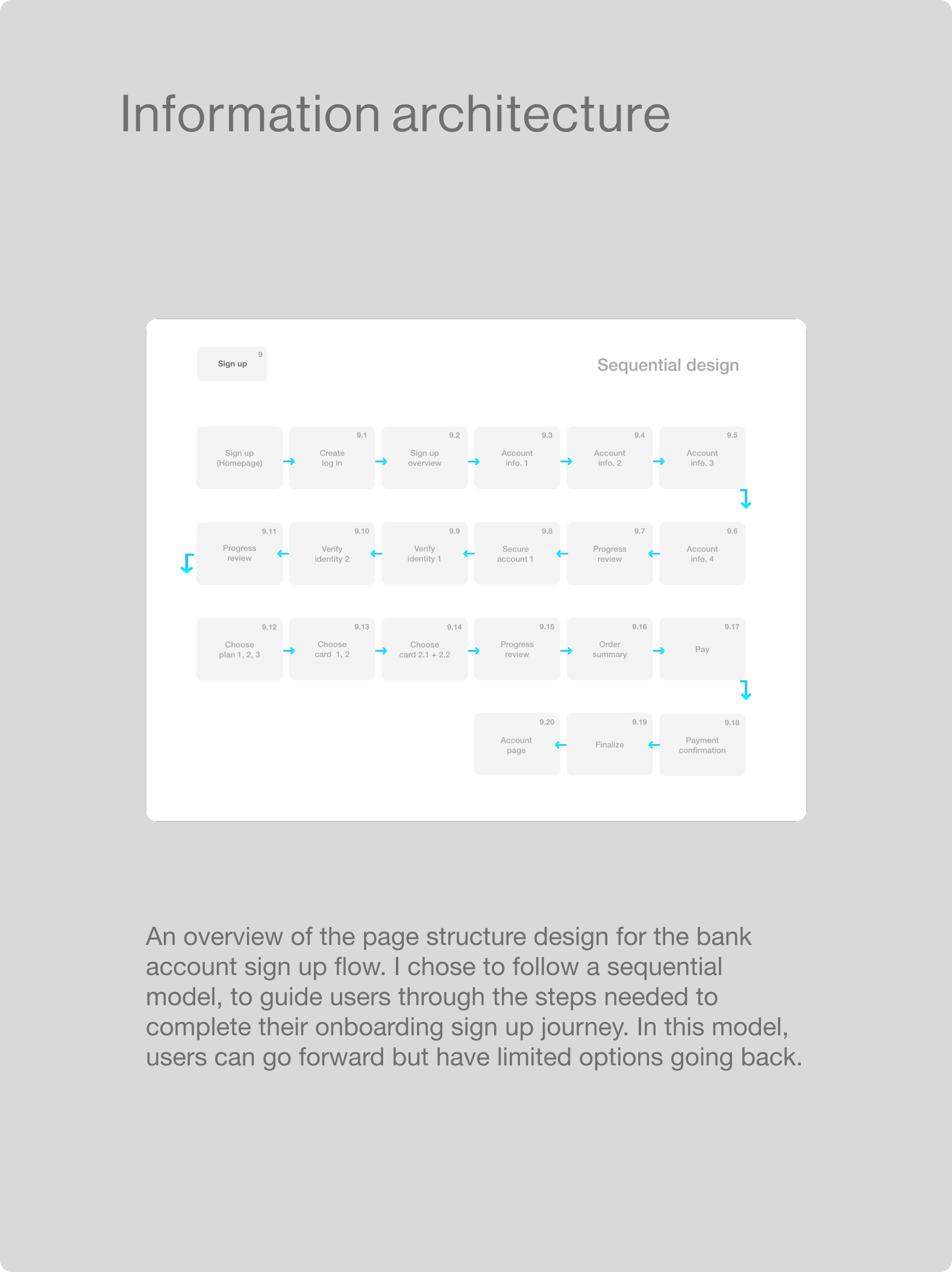
Mapping low-fi designs for a responsive web based user onboarding flow
Digital wireframes
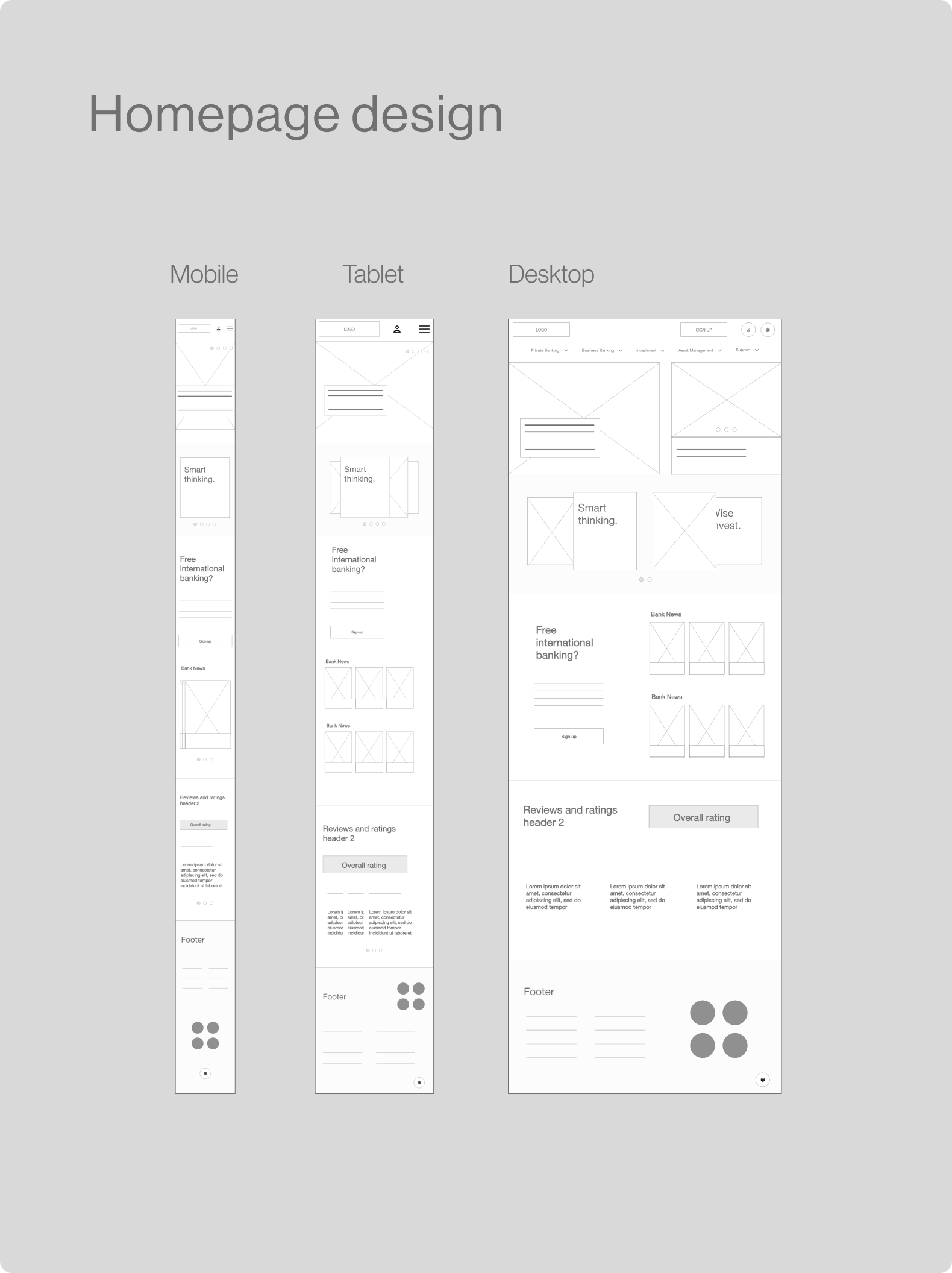
The digital wireframes for the low-fidelity prototype were created based on the knowledge gained from the foundational user research. The wireframes address user’s pain points by offering users: 1) a simple, quick sign up process 2) a brief sign up overview 3) more user feedback in the verification process
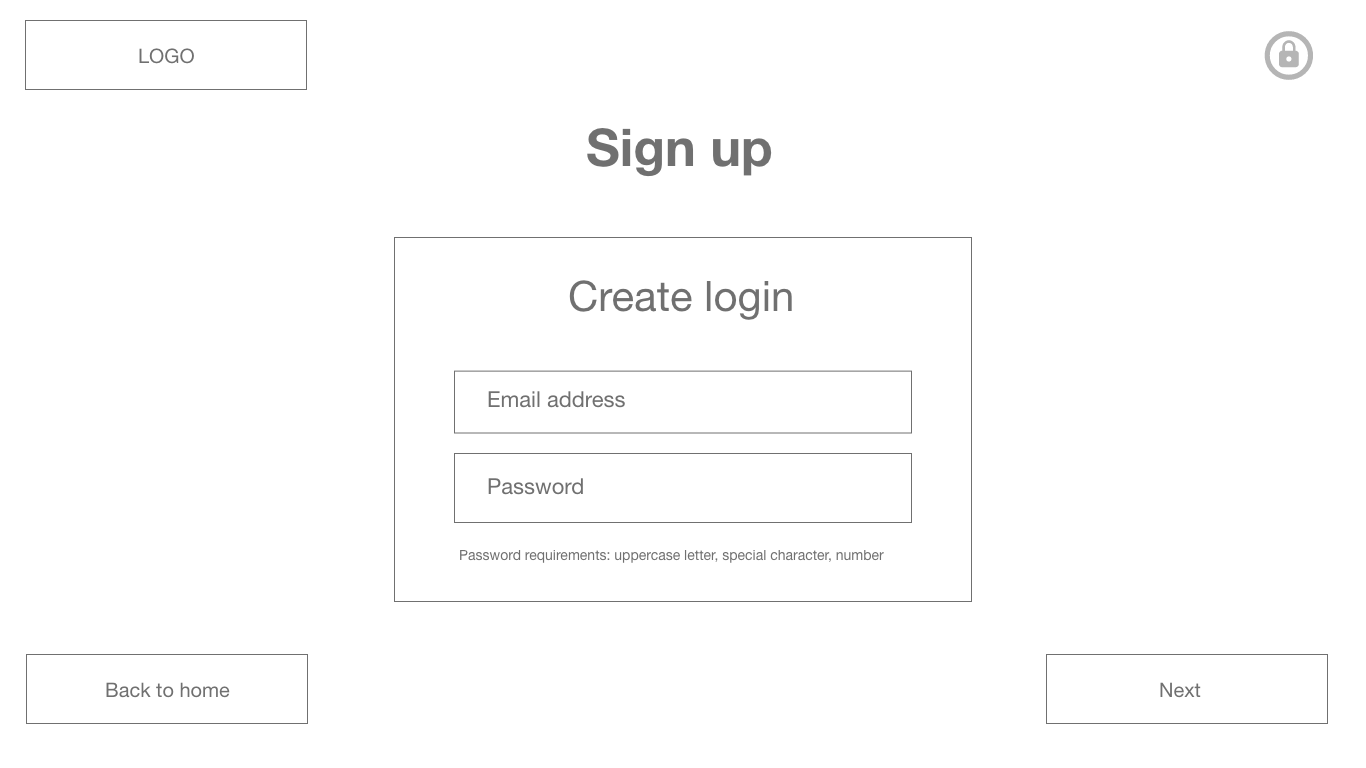
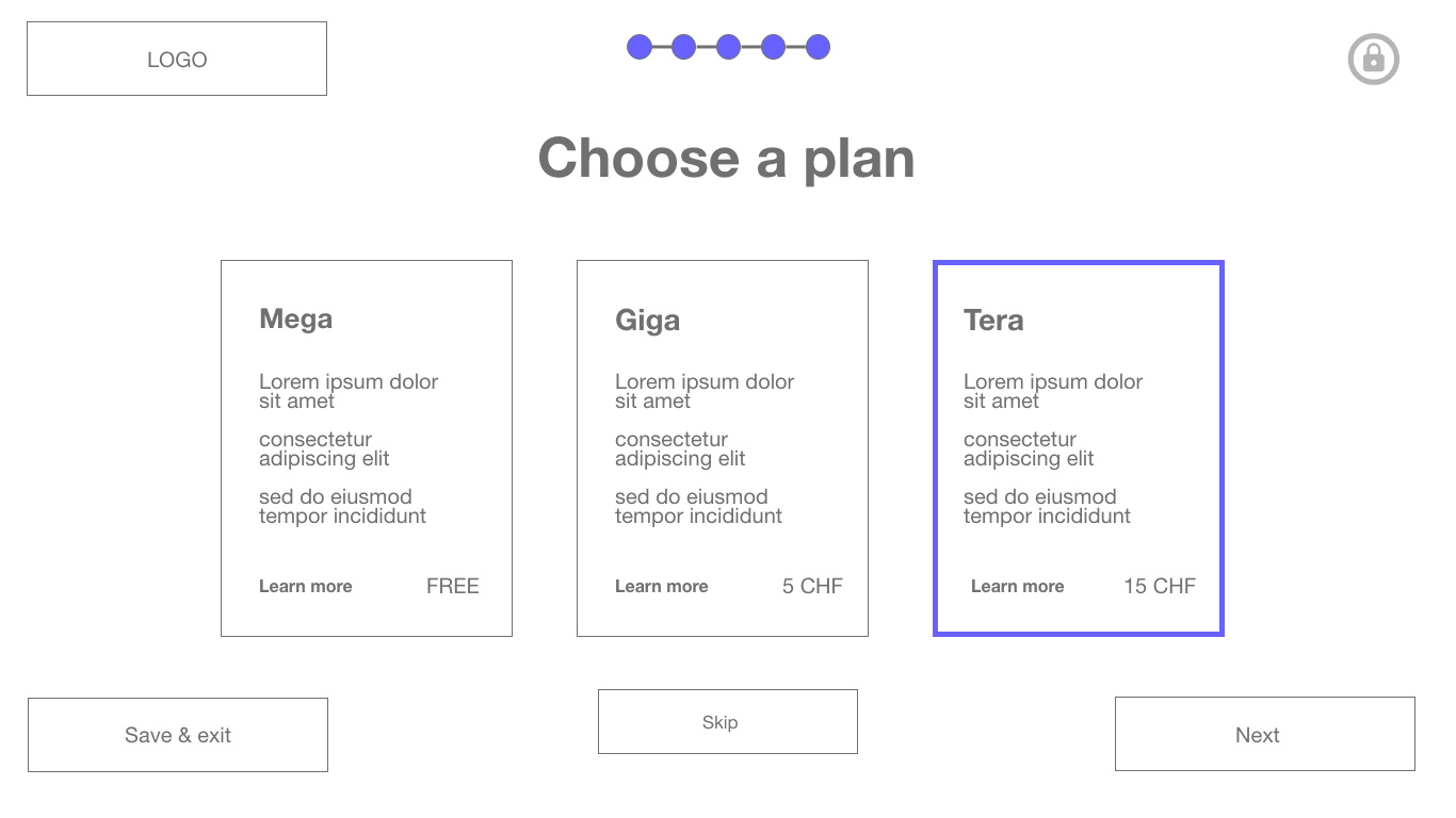
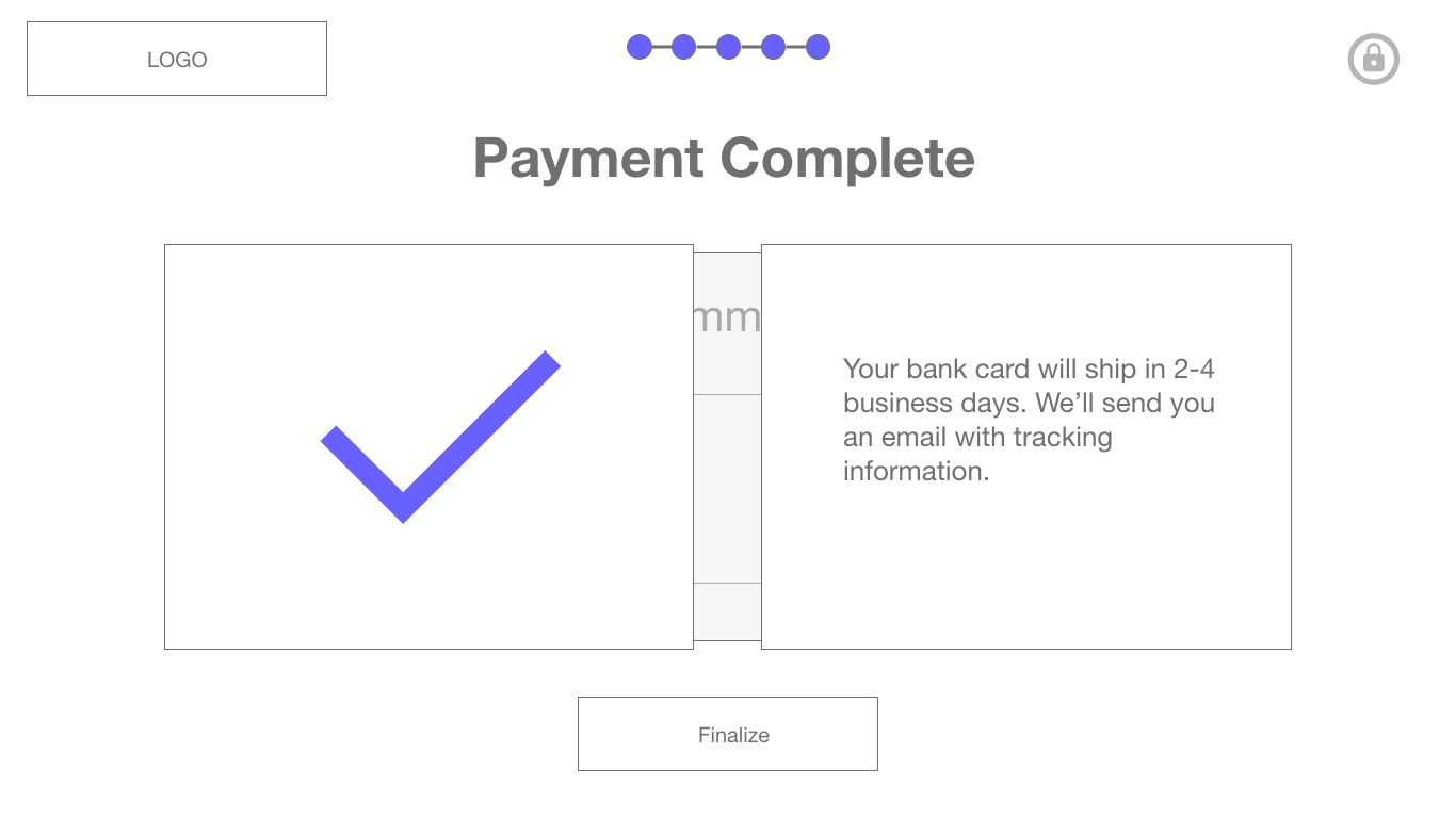
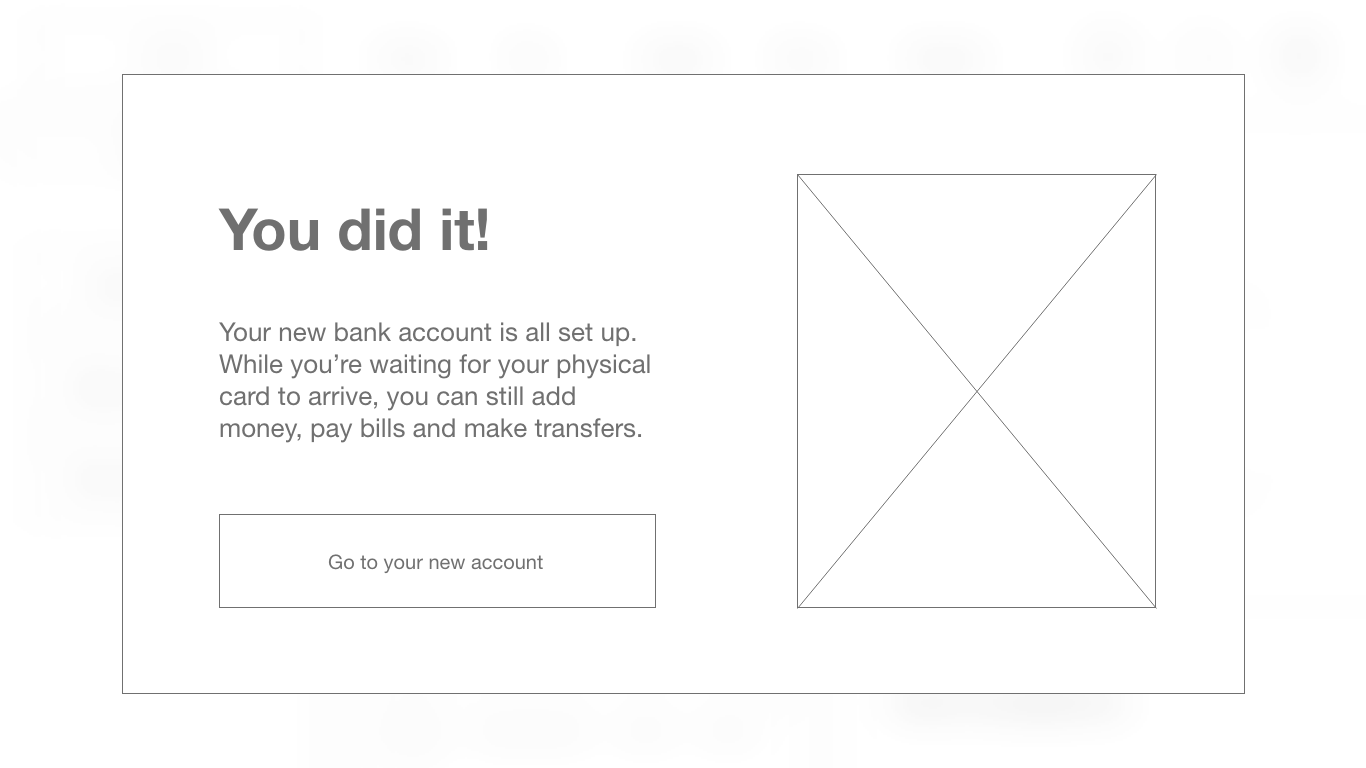
Simple and quick
Users are given the option to sign up from two locations on the homepage: 1) above the fold, as a CTA button in the header and 2) below the fold, as a CTA for free banking below the fold.
The process is estimated around 10 minutes, but users who are tech savvy and prepared may take much less time to onboard.
Sign up overview
Users are given a sign up overview after the first step in the process: creating a user log in. The sign up overview gives the user an estimated time of completion, an overview of the security measures used to protect their data, and a heads up of what documents and tools they will need during the process so they can begin “prepared”.
Increased feedback
Users are given helpful feedback in the verification process. To begin the verification process, for instance, they are prompted to enable their camera. They are also given the possibility to retake their live photo used for verification.
Checkout out the low-fidelity prototype
Desktop flow with Adobe XD
Usability study
To understand how well the designs performed with users, I conducted a remote unmoderated usability study. I chose 4/5 participants who had never onboarded digitally, in order to understand the new user experience. The five participants were: age 26-48, with 3 female and 2 male, and 3 Swiss nationals and 2 international participants.
My main research goal was to assess how easy it was for users to get through the main action: completing the full onboarding process, from start to finish. As the onboarding process involves the user going through 20+ screens, I also added an SUS questionnaire to gauge whether users found the process to be too complex or too lengthy, and asked users whether or not they had any additional feedback about the process at the end of each activity.
Actionable insights
Users would like more information landmarks
Observation 1: 3/5 users requested more information during the process
Observation 2: 4/5 users tapped the info. buttons available in the choosing a plan/card and verification stages
Observation 3: 1/5 users didn’t complete the payment process and was unsure what was being requested of them during this step.
Users need extra cues to guide them through the process
Observation 1: 1/5 users didn’t complete the sign up process
Observation 2: 2/5 users reported that they didn’t feel confident during the process
Observation 3: 3/5 users were cautious about moving forward with the “next buttons”
Mockup designs for high-fidelity prototype
The mockups for the high-fidelity prototype feature several changes based on the usability study. There were several high priority changes made to make sure no users drop off because of uncertainty and to make sure that users complete a crucial part of the onboarding process: the checkout.
Some of these changes were in the category of UX writing, and involved molding the language used in these steps to meet user’s uncertainties or doubts in regard to what to “do” next. Another major change was structural, and involved adding quick progress markers, so that users have a better idea of where they are at in the process and what they need to do in order to complete the sign up.
-

Pay and finalize
Users are now given clearer and more concise language during the checkout step to guide them towards the end of the process. Users are promoted to pay for their plan in the title and the button below reads “pay” instead of next.
-

Choose a card
Users were very curious about the difference between virtual and physical cards in the study. Now users are given more information at a glance about the bank card that they will order and can even link to a learn more section.
-

Sign up overview
Users are given information about the documents they will need during the process before they begin. On the mobile version users will need their government ID and on the desktop version they will need their phone and ID.
-
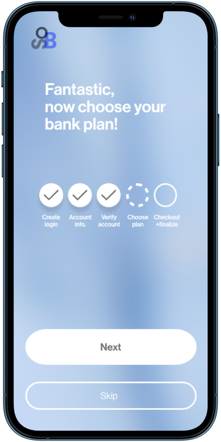
Confirmation page
Users are given progress indicators once they begin they pass the sign up overview and begin the process. These indicators give them insight into their end goal, which is to checkout and finalize.
Checkout out the high-fidelity prototype
Desktop flow with Adobe XD
Project learnings
Guide new users
This is the lesson of every digital product’s evolution and is something that should be remembered in each designer’s journey because it’s true every time!
While half of the new users, who had never onboarded digitally, exceeded my expectations and exuded both curiosity and confidence in their actions, the other half did not. Equitable design means taking those users’ needs, who may be disadvantaged in some way, and designing for them first.
Consider accessibility
While transforming the low fidelity designs to high fidelity mockups, I was able to reflect on accessibility conditions. I chose a simple color palette for color blind users, and made sure important messages were not only communicated through color but through other visual cues. I also redesigned the button placement on the desktop version. Before, the next and back buttons were far away from the data inputs. Now they are much more accessible to each other which will benefit all users but especially those who use a keyboard for navigation.
Allow mistakes
With sequential design, users are lead forward through multiple tasks until they reach their conclusion. Using this type of design, I had to be especially cognizant of where in the process it might be important for users to be able to go “back” or to “exit” the process altogether. The progress markers in the hi-fi designs are, therefore, designed to be for users who need to leave the sign up process altogether, and who need to be reminded that their progress will be saved. In contrast, the “back” buttons in between progress markers help users navigate within the step and correct errors that they might have made along the way.


