Project overview
UX RESEARCH
Research methods
User research
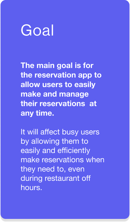
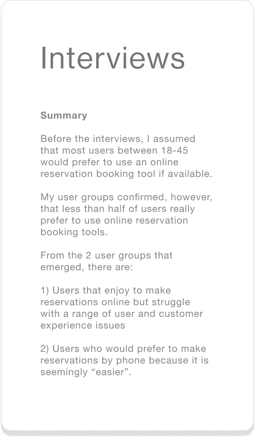
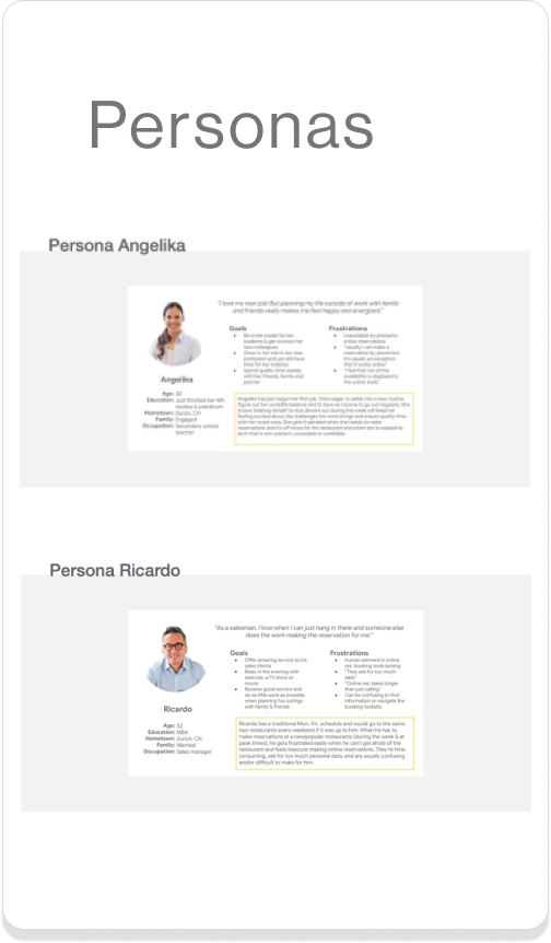
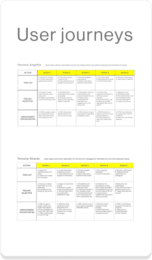
In the first stage of designing, I conducted 6 user interviews, and created user journeys and personas, to better understand people who make reservations at restaurants on a monthly basis.
Competitive audit
To begin ideating solutions to the main user pain points, I carried out a competitive analysis of 4 direct and indirect competitors that offer restaurant reservation platforms in Europe, the U.S. and Switzerland.
Usability studies
In order to iterate, I planned 2 studies. The overall research goal was to understand how easy it was for users to use the app. Each study had different target goals to assess the user’s experience during different tasks.
What I learned about users who make restaurant reservations
Reservations by phone
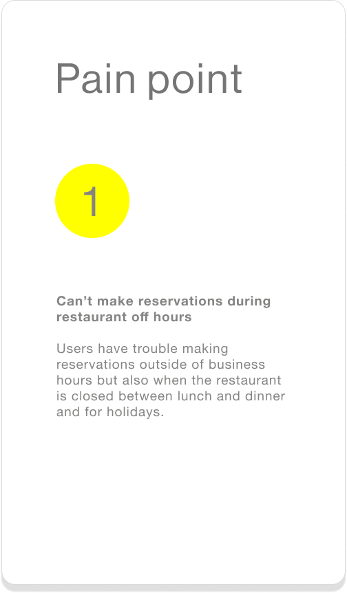
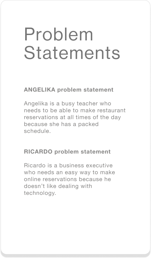
User pain point: reservations can’t be made anytime. Many people are frustrated with the limited availability traditional methods of making reservations, i.e. by phone, present. Restaurants are not available 24 hours a day, often close for holidays, and have limited working hours—for example, in post-pandemic Zurich many restaurants have started to close on Mondays.
Reservations online
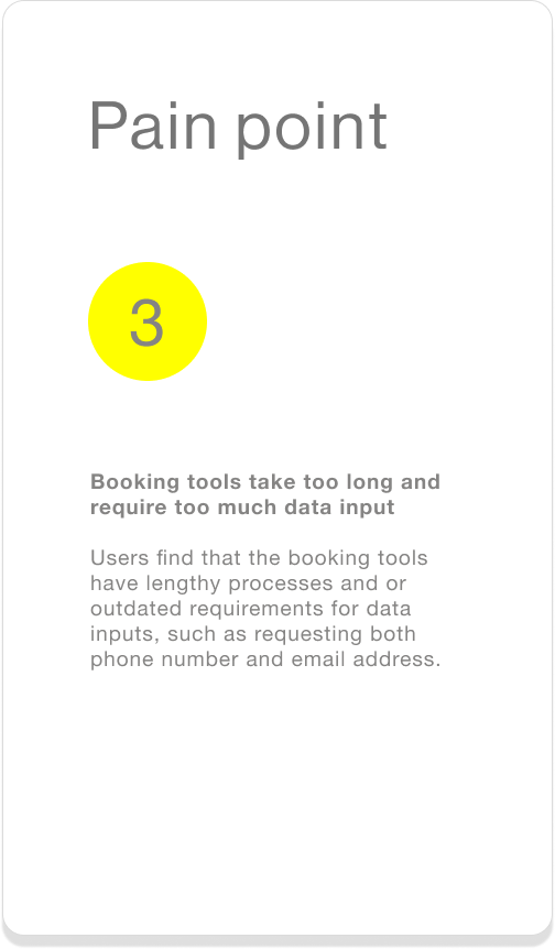
User pain points: 1) online process is not as reliable 2) processes are too lengthy and require too much data input. Notably, there are some people who have had no problems making their restaurant reservations online. The majority, however, have had problems with the product offerings that small and large online bookings platforms offer. Users cited issues with reliability—in cases where the reservation platform submits only a request, and therefore the reservation is not confirmed immediately—too much personal data required to create a reservation and lengthy processes, and platforms in which the availability of reservations is not transparent right away—on platforms where users are required to input a date and time, even if that date/time does not have any availability.
Current booking tools
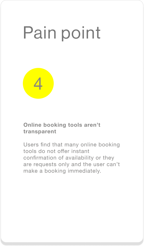
User pain point: availability is not transparent. This is not the case for booking platforms like The Fork and Opentable, which offer instant booking. However, while these platforms do offer a well designed, user friendly experience for people looking to make restaurant reservations, they have an extremely small pool of desirable local restaurants to choose from. Many local restaurants in Zurich do not use these platforms but have developed their own booking tool for their restaurants. Unfortunately for users, many of these platforms allow people to make reservations, but often lack key features that make the experience useful, enjoyable and useable for restaurant goers. Three of the main issues with local booking platforms are: 1) they do not offer instant booking confirmation 2) they are request only 3) there designs are older and often lack user friendly features, like a mobile website with responsive design.

What restaurant-goers are saying about making restaurant reservations
“Frustrating when they don’t understand me, nobody picks up the phone, there’s no online tool.”
—Restaurant-goer
“Usually I can make a reservation by phone but it is really usually an exception that it works online...”
—Restaurant-goer
“It is so annoying when restaurants do not show their availability online, and instead it is ‘requests only’.”
—Restaurant-goer
UX DESIGN
Connecting research to design
User flow
Digital wireframes
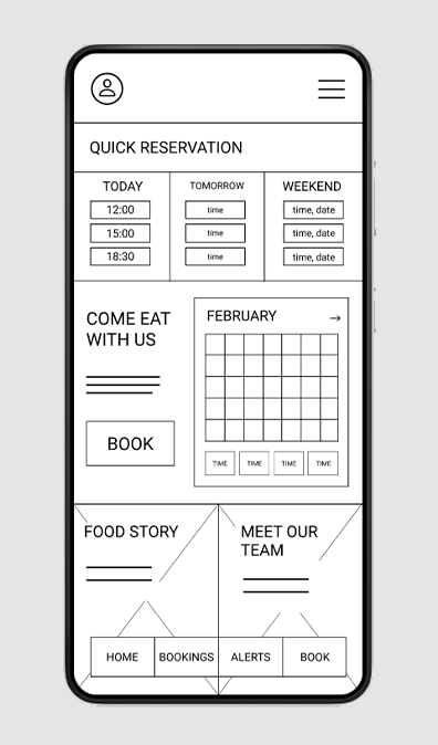
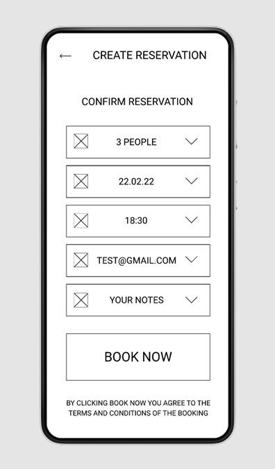
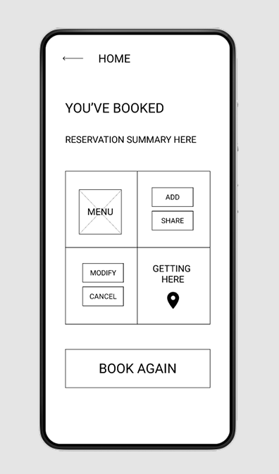
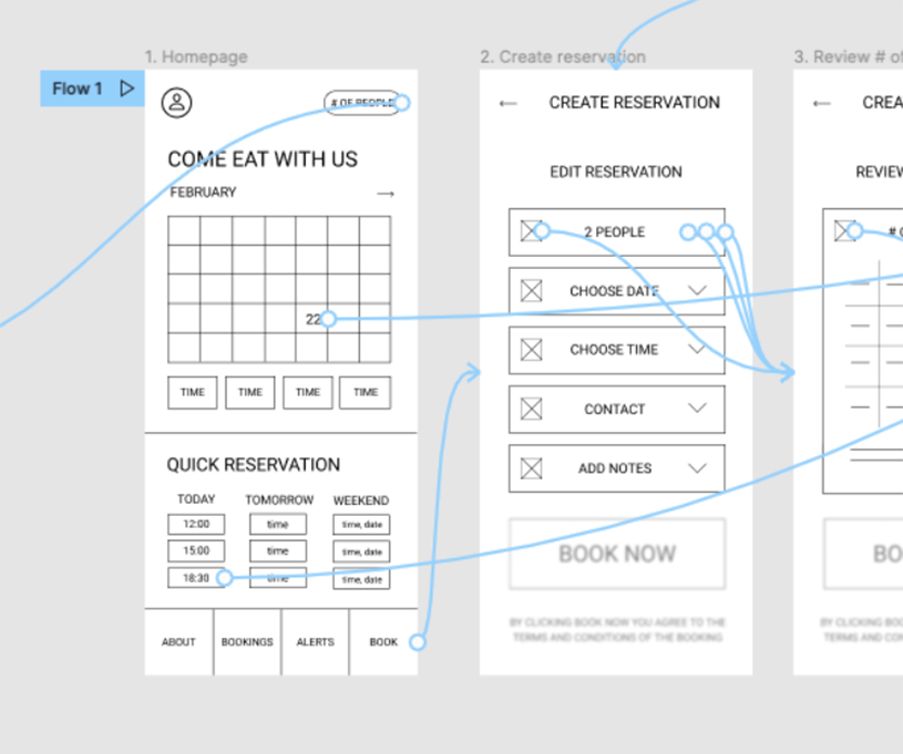
The digital wireframes for the low-fidelity prototype were created based on the knowledge gained from the foundational user research. The wireframes reflect the user flow above, and their designs address user’s pain points by offering users: 1) immediate reservation confirmation 2) minimized data input and 3) increased transparency regarding availability.
Immediate confirmation
Users are only shown dates and times which are available, starting on the homepage, so that they can have an immediate confirmation of their booking at the end of the booking process.
If the user exceeds the booking time allowed before confirming their reservation, a pop up message with countdown timer appear to alert them.
Minimized data input
Notes are optional, and their space on the page confined. If the user has no notes to input, they can continue to book without needing to initiate the drop down menu for this section.
Also, user contact information from sign up is stored as a contact preference for reservations and will appear as soon as the user selects a date/time from the calendar.
Increased transparency
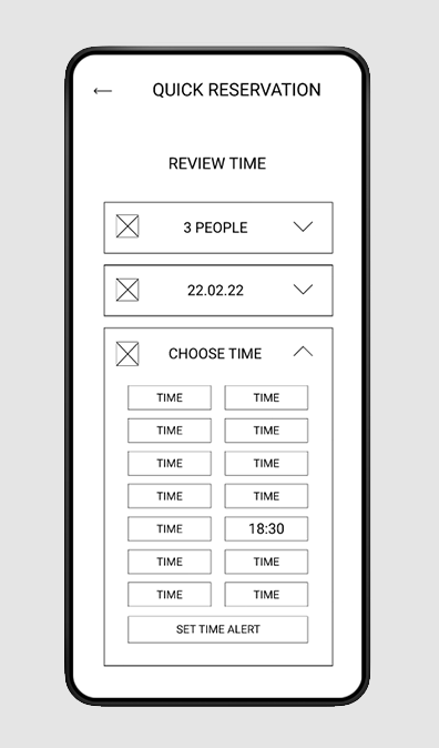
Users can only select available times from the calendar feature on the homepage and will only see unavailable times if or when they edit the time on their reservation at a later stage in the booking process .
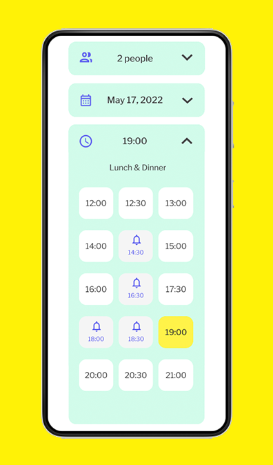
In addition, users can set an alert to notify them if a reservation becomes available at a date/time that was previously unavailable.
Usability study 1
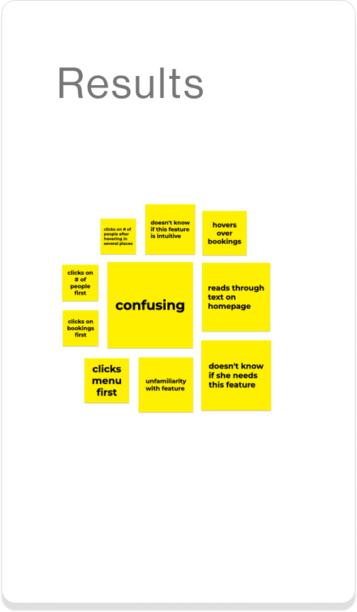
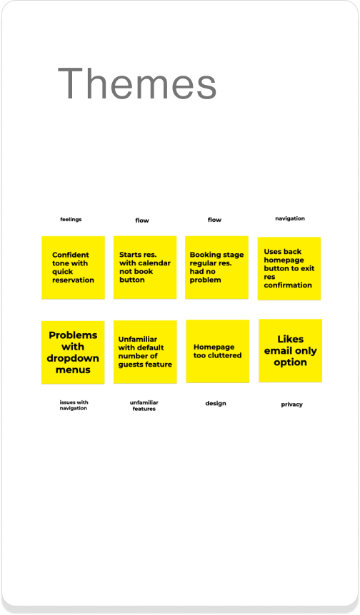
During the first round of testing, my main research goal was to assess how easy it was for users to complete the main action: making a reservation in the app. In addition to this, I also wanted to learn: how quickly users could make a reservation, where users were getting stuck in their task flow, and if users were interested in any other features on the app.
3 Actionable insights
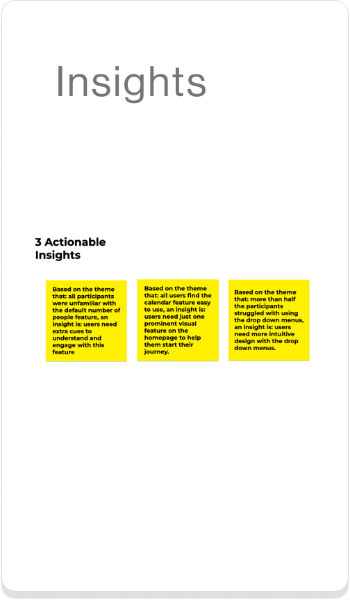
1. Simplify: users prefer one prominent visual feature on the homepage to start their journey
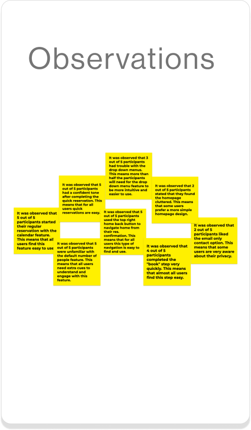
Observation: all users’ click flow started at the calendar feature when creating their first reservation.
Action: Pare down the homepage design, and prioritize CTA as starting point for the main action (e.g. to create a reservation).
2. Every click counts: provide users with more intuitive design on the drop down menus
Observation: more than half of users struggled with using the drop down menus to edit details.
Action: Increase clickable areas that trigger drop down menu to extend and retract, and retract drop down menus after a selection has been made.
3. Take care: provide interactive cues to help users understand new and/or unknown features
Observation: almost all users were unfamiliar with the edit default number of people feature.
Action: Add animation to the button on the homescreen in the high fidelity designs and explain this feature in an onboarding screen.
Re-iterated low-fidelity prototype
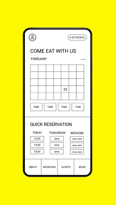
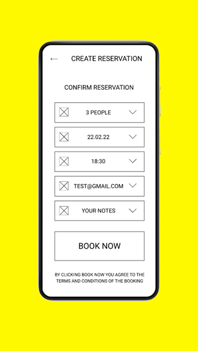
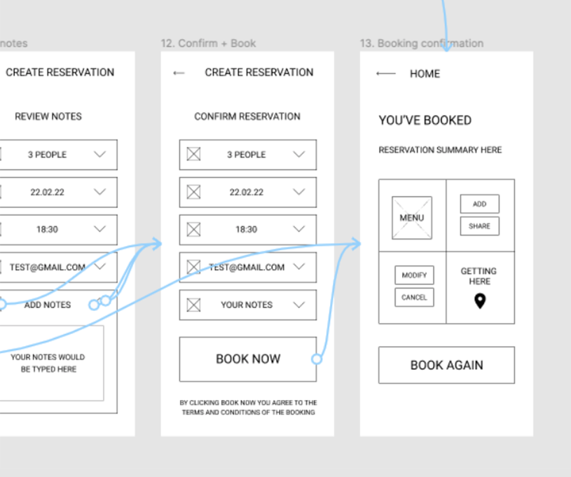
Based on insights gathered during the usability study, the new prototype has a simplified homepage and ‘reservation confirmation’ page, and increased functionality in the drop down menus.
Mockup designs for high-fidelity prototype
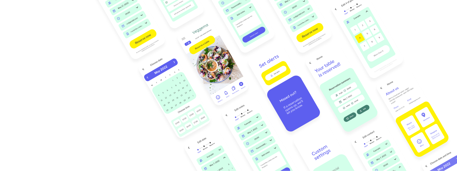
The mockups for the high-fidelity prototype feature several changes based on the first usability study: 1) a large CTA, call-to-action, on the homepage as the start of the user journey 2) a redesigned ‘calendar’ page 3) increased functionality of the drop down menus in the input/review stage and 4) a pared down ‘reservation confirmation’ page.
-

Homepage
On the homepage the CTA is the main focal point, i.e. the beginning click that starts most users on their reservation journey. In addition to the CTA, users also have a reserve button on the bottom navbar to initiate a reservation.
-
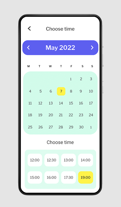
Calendar feature
Users engaged with the calendar feature most in the low-fidelity testing, so I decided to expand the calendar feature and make it the second step of the user’s journey in making a reservation.
-

Input + Review
After 3 clicks, users can already reserve a table. If the user needs to edit the date/time of their reservation, or set an alert for a desired date/time, they can do so from this page. When users expand the drop down menu the stepper state reflects this by returning to the “input” field.
-

Confirmation page
The simple design of the ‘reservation confirmation’ page allows users to focus on the immediate actions they may want take after the reservation has been made: like reviewing a summary of their reservation, sharing the reservation with a friend or adding it to their calendar.
Usability Study 2
During the second phase of testing, I conducted a usability study with the mockups in a high-fidelity prototype. My research goal was to understand how easy it was for users to use the new iteration of the app. I tested the reservation flow again, and the ease with which users could navigate multiple pages on the app, and use new features, like changing the default number of guests and setting alerts.
3 Actionable insights
1. Smart thinking: provide users with multiple entry points to menu options.
Observation: the majority of users used the hamburger menu before the bottom navbar to navigate during non-reservation making tasks.
2. Cancel vs. Modify: allow users to both cancel or modify reservations.
Observation: more than half of the users expected that they would be able to modify their reservation versus cancel and rebook.
3. Stay transparent: continue giving users helpful information throughout.
Observation: most users recognized disabled time slots and alert icons function, even though they were unfamiliar with the ‘set alert’ feature in general.
Re-iterated hi-fi screens
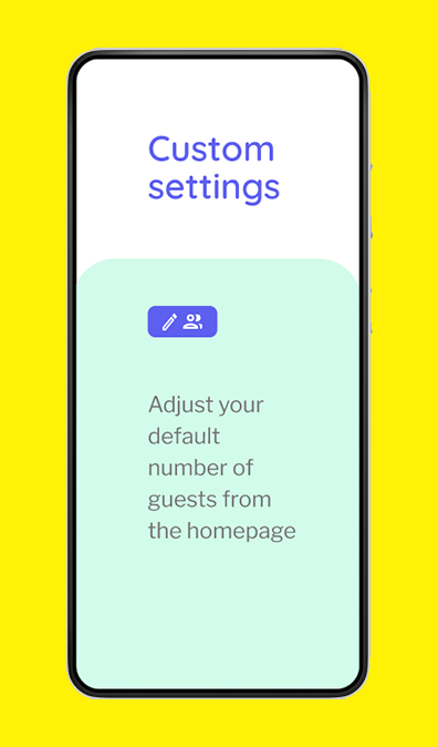
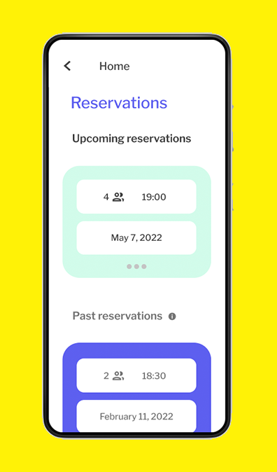
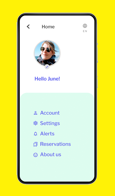
I made several changes based on the insights from the second usability study: 1) an updated onboarding screen to promote user engagement with the default number of guests feature 2) a redesigned ‘reservations’ page to help users fastrack solutions to potential mistakes 3) updated visual design on alert icons and text, to add distinction and 4) a condensed menu page for easy in-app navigation.
Learnings
Guide new users
Onboarding screens with the default number of people icon can help users become familiar with this function on the homepage. Icons, such as the purple alarm icon, distinguish time slots that are ‘unavailable/alert only’ from 'available’ time slots, and can help users who have never used a ‘set alert’ feature before.
Allow for mistakes
With the three dot editing feature on each reservation on the ‘reservations’ page, users have a simple interface that allows them to review their reservations and, if need be, edit their existing reservations. In the expanded editing state users can now view/share/add and modify/cancel their reservation.
Enable ease
With the new menu, users can navigate with ease. From this page users can access all menu links in one location, while also still having quick access to important links from the bottom navbar on the homepage. Users will now also be linked to the ‘about’ page when they click on the Veegma logo on the homepage.
VISUAL DESIGN
Designed with Figma.
